Bootstrap 5 Grid System Explained: A Practical 2026 Guide
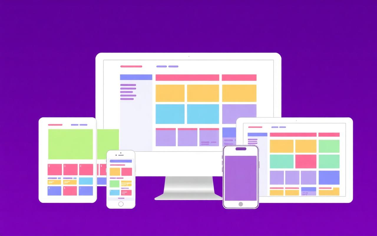
Bootstrap powers more than 25% of all websites on the internet, and the grid system is the single biggest reason. In a few lines of HTML you get a fully responsive 12-column layout that works from a 320-pixel phone to a 4K monitor. This guide walks through every piece of the Bootstrap 5 grid, with copy-paste examples for each.
The three pillars: container, row, column
- .container or .container-fluid — defines the maximum width and centers content
- .row — a horizontal group of columns, with negative margins to offset gutters
- .col-* — the columns themselves, sized using a 12-column system per breakpoint
<div class="container">
  <div class="row">
    <div class="col-md-8">Main content</div>
    <div class="col-md-4">Sidebar</div>
  </div>
</div>Breakpoints in Bootstrap 5
Bootstrap 5 ships with six breakpoints. Each one corresponds to a class infix you can use to control column behavior at that size and up.
- xs — <576px (no infix, applies by default)
- sm — ≥576px (.col-sm-*)
- md — ≥768px (.col-md-*)
- lg — ≥992px (.col-lg-*)
- xl — ≥1200px (.col-xl-*)
- xxl — ≥1400px (.col-xxl-*)
Auto-layout columns
Use plain .col (no number) when you want equal-width columns that split the row automatically. Add .col-auto when you want the column to size itself to its content.
<div class="row">
  <div class="col">1 of 3</div>
  <div class="col-auto">Sized to content</div>
  <div class="col">1 of 3</div>
</div>
Gutters, alignment, and ordering
Bootstrap 5 introduces utility classes for gutters (.g-0 through .g-5), horizontal and vertical alignment (.justify-content-* and .align-items-*), and column ordering (.order-*). These let you fine-tune layouts without writing a single line of custom CSS.
When NOT to use the Bootstrap grid
If you only need a single one-dimensional layout (a navbar, a button row, a card footer), reach for Flexbox utilities or plain CSS instead. The grid is built for two-dimensional, multi-column layouts. Using it everywhere leads to deeply nested markup that's hard to maintain.
Performance tip: import only what you need
Bootstrap's full CSS bundle is around 230KB. If you only use the grid and a handful of components, you can import just the SCSS partials you need and cut your bundle size by 70% or more. Pair this with PurgeCSS or Vite's tree-shaking for production builds.
Conclusion
The Bootstrap 5 grid is still one of the fastest ways to build a responsive layout in 2026. Combine it with semantic HTML, custom CSS for unique touches, and accessibility best practices, and you will ship polished pages in a fraction of the time.
Frequently asked questions
Is Bootstrap 5 still relevant in 2026?
Yes — it remains the most popular CSS framework and a fast path to shipping responsive layouts, especially for prototypes, dashboards, and internal tools.
Should I learn the Bootstrap grid or CSS Grid first?
Learn CSS Grid first; it teaches you the underlying concepts. Then Bootstrap's grid becomes a thin convenience layer on top.
Keep reading
External references
Enjoyed this article?
Share it with a fellow developer or explore more tutorials in our blog.
More articles